Safety-critical tools demand interfaces that never fail the people using them.
NDT engineers inspect pipelines, aircraft, and infrastructure. The data they transfer is sensitive. The environments they work in are demanding. Evident Connect was the tool meant to support that work, but the interface had not kept up.
Two navigation menus fighting each other. A shared workspace with no role separation. Touch targets too small for field use. Visual clutter at every step.
Two menus with overlapping functions created constant confusion about where to go.
Every user saw every file. Shared workspaces with no personalization made organization impossible.
Small touch targets and no clear resume-workflow meant engineers lost time and place constantly.
The visual design had fallen so far behind that it eroded trust before users even started a task.
" Engineers were not asking for more features.
They were asking for less friction.
Research sessions with engineers across oil and gas, aerospace, and infrastructure revealed a consistent picture. These users were not asking for more features. They were asking for less friction. Simpler screens. Workspaces that felt personal, not communal.
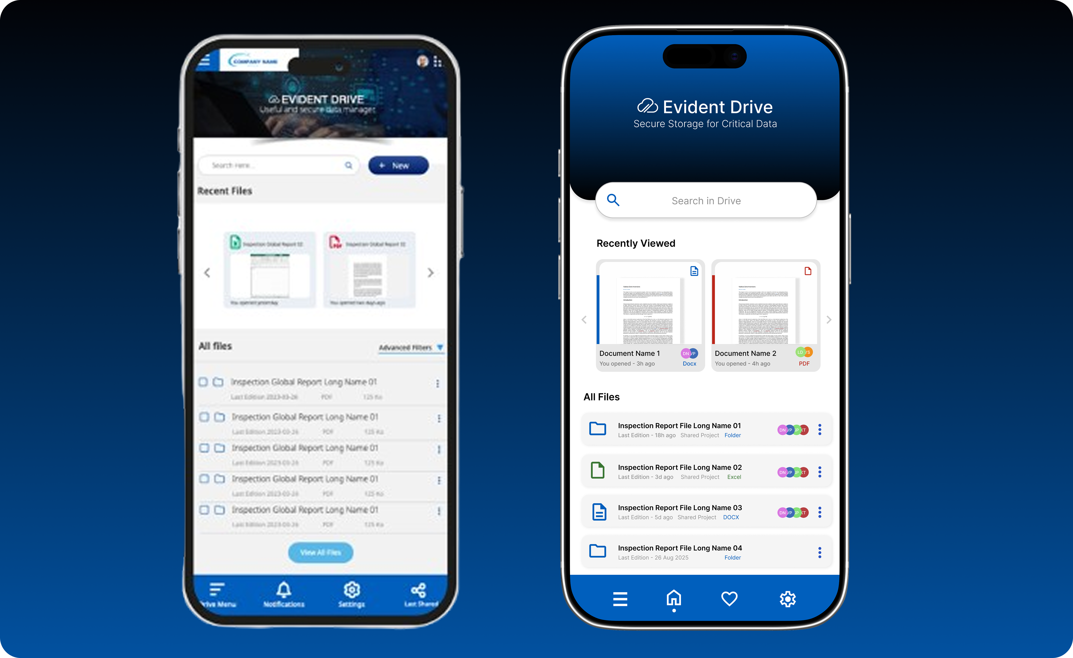
One menu, unified logic. Immediately clearer.
Each user sees only what is relevant to their role. Reduces noise and scanning time.
Built for glanceability. Content prioritized over chrome.
All three directions merged into a single system. Unified navigation removed the decision tax. Role-based workspaces gave engineers a sense of ownership. The mobile-first hierarchy made every screen faster to read and act on.
The redesign turned a fragmented, cluttered tool into something engineers could trust under pressure.
A single consistent path through the app replaced two competing menus.
Role-based views so every user sees what matters to them and nothing that does not.
Engineers resume work instantly without hunting through folders.
Larger touch targets, better spacing, and a calmer visual structure built for speed.
Faster task completion across core file management workflows
Stronger user confidence navigating shared project environments
A scalable design foundation ready for new features without structural rework
The temptation in enterprise redesigns is to add. More filters, more views, more options. The research said the opposite. Engineers under pressure do not need more surface area. They need the right surface area. Reducing complexity is not a design shortcut. It is the hardest and most valuable thing a designer can do for a product like this.