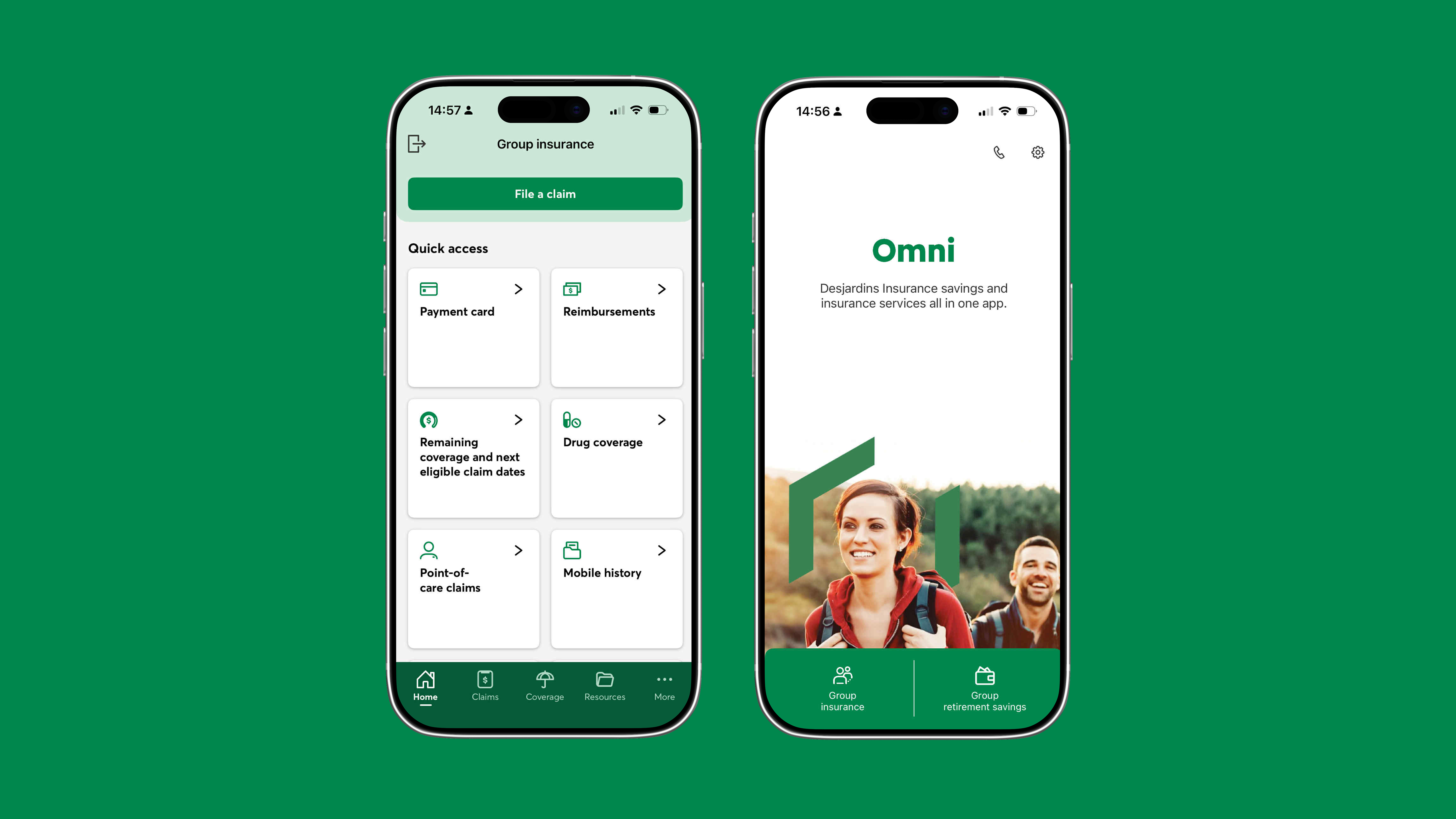
One platform to replace five. A ground-up redesign of a fragmented benefits experience built around clarity, trust, and speed.
Companies were forcing employees to bounce between PDFs, employer portals, and legacy insurer apps just to answer basic questions about their own coverage. HR teams fielded endless support tickets. Reimbursements were opaque. Retirement features went completely ignored.
This wasn't a UI problem. It was a trust and clarity problem.
Five tools to answer one question.
Jargon-heavy UI buried the essentials.
Multi-step forms with zero progress feedback.
Users couldn't track what happened to their claims.
" Users didn't need more features.
They needed less friction.
Research across user interviews, app store reviews, HR feedback, and competitor teardowns pointed to one insight: reduce friction at every touchpoint.
Benefits, claims, and retirement under one roof.
Submit, track, view. Front and center.
Plain language throughout, aligned with compliance.
Status and eligibility visible at every step.
All coverage in one place. No more PDF hunting.
Fewer steps, inline guidance, real-time eligibility checks. Errors dropped, submissions improved.
Coverage details accessible in seconds, no login needed.
Remote care built into the core experience.
Financial-grade security that feels effortless.
faster claim submission
increase in coverage clarity
less "where's my claim?" confusion
HR support ticket volume
Outcomes were validated through sessions with HR teams and end users prior to full deployment, confirming direction and unlocking build phase sign-off.