A Montreal coffee shop needed a brand as alive as the neighbourhood it lives in.
Ruelle is a Montreal coffee shop. The name comes from the French word for alley, the kind of narrow, character-filled backstreets that make Montreal neighbourhoods feel like their own little worlds.
They needed a full brand built from nothing. Logo, packaging, menu, social presence. Everything a customer touches had to feel consistent and intentional.
" The name already had a story.
The job was to make it visual.
Ruelle means alley. Alley cat in French is chat de ruelle. That connection became the entire foundation of the brand.
The logo uses typography shaped to suggest a cat, the letterforms doing double duty as both wordmark and character. It is not illustrated on top of the type, it lives inside it. The result is a mark that rewards a second look without demanding one.
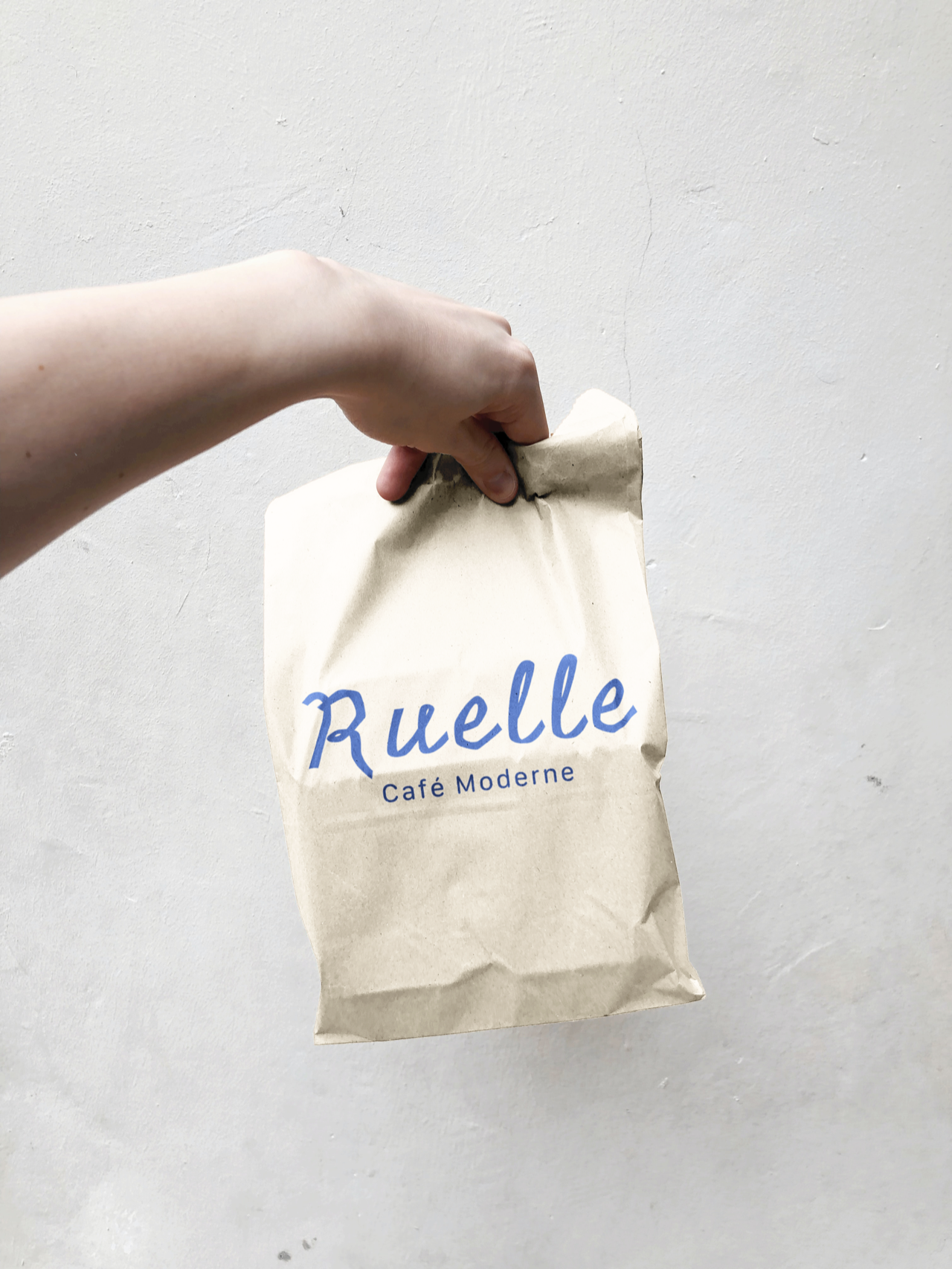
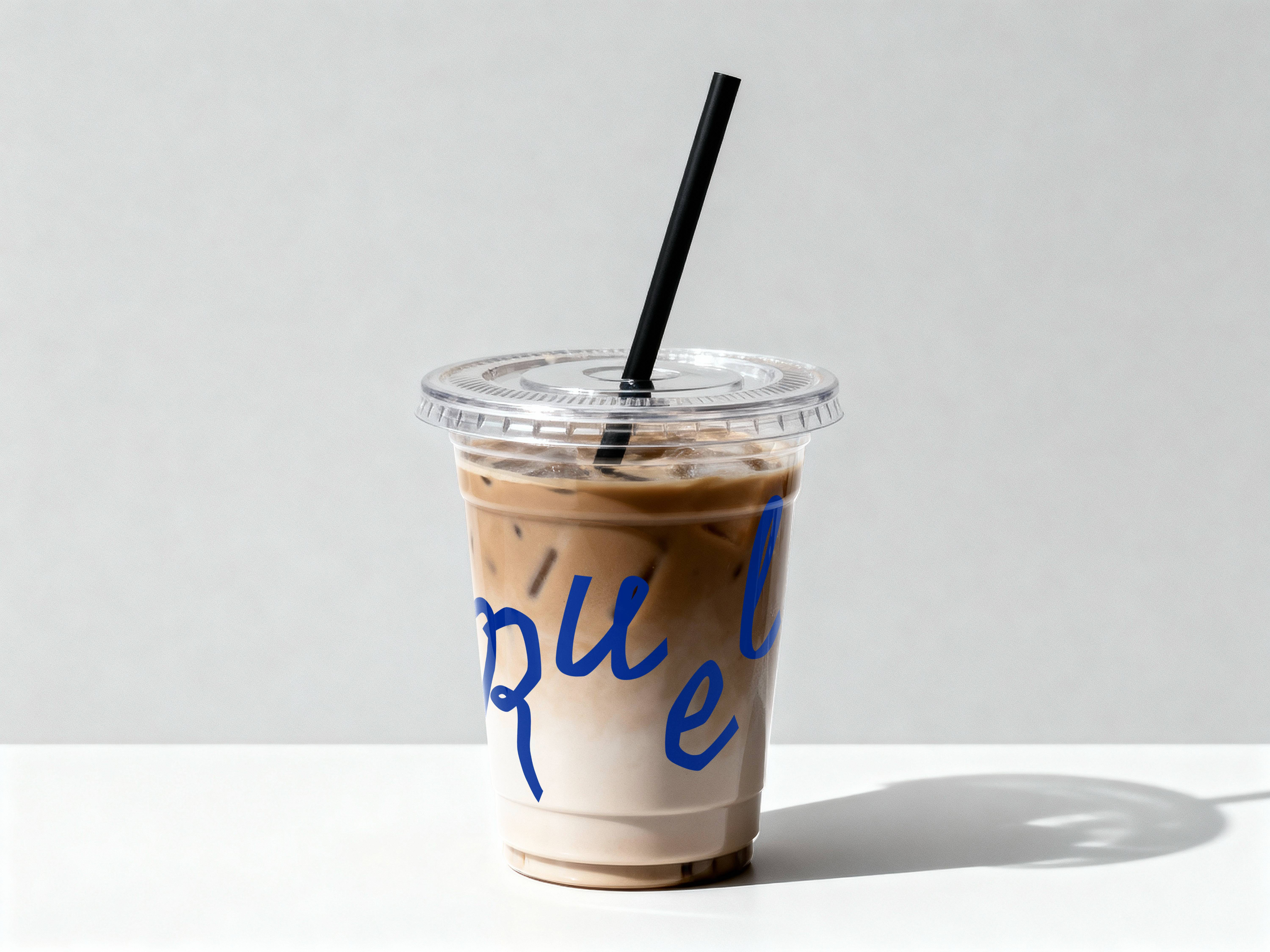
The colour system leaned into something bold and unexpected for a coffee shop: cobalt blue and warm cream. Not the safe browns and greens of the category. Something that stands out on a counter, on a cup, on a feed.
.png)
The brand had to stretch across a full set of physical and digital surfaces without losing its personality.
A wordmark that carries the cat concept without ever being literal about it.
Multiple cup directions explored, all anchored in the blue and cream palette with the hand-drawn aesthetic carried through.
.png)
Pastry bags and kraft bags with "C'est Prêt!" as the customer-facing message. Warm, French, local.
Designed to match the brand voice: readable, characterful, nothing generic.
A consistent set of social assets so the brand stays coherent off the counter and on the phone.
A local coffee shop with a strong visual identity punches far above its size. People photograph it, share it, remember it, come back for it. Ruelle now has a brand that can grow with the business, from one location to many, without ever needing to start over.